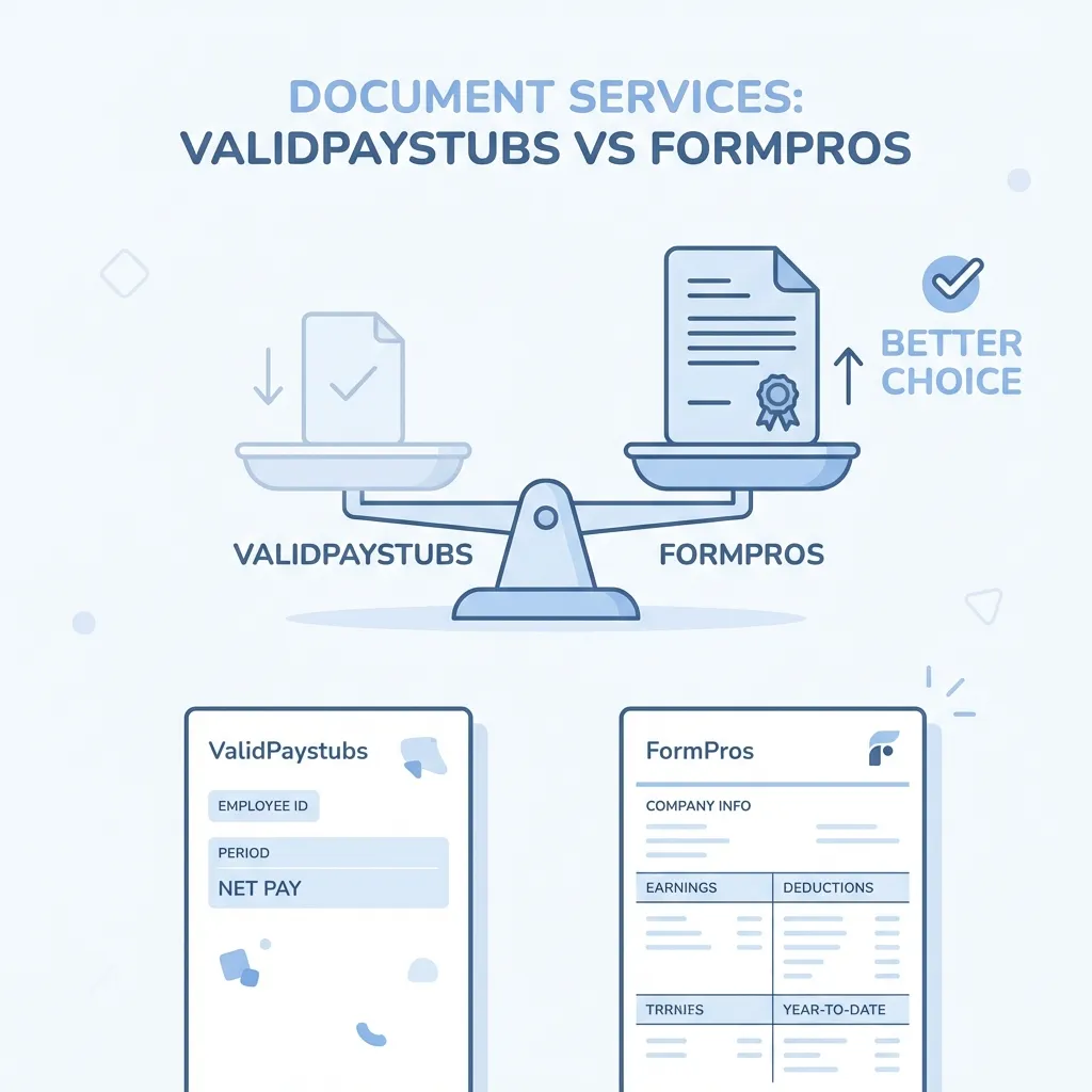
PaystubCreator.net Review 2026: Design Quality Matters More Than You Think
PaystubCreator.net Review 2026: Design Quality Matters More Than You Think
Let's talk about something most paystub generator reviews ignore: design quality.
When you're creating an income verification document, you might think the numbers are all that matter. Put the right income, the right taxes, the right dates—and you're done, right?
Not quite.
In 2026, document reviewers (loan officers, landlords, HR professionals) have developed sophisticated eyes for spotting low-quality documents. The visual details—typography, resolution, layout density, color choices—all contribute to whether your document looks "real" or "generated."
PaystubCreator.net has been in the game for a while, producing functional paystubs. But functional isn't the same as professional.
In this design-focused review, we'll examine exactly why visual quality matters and how ValidPaystubs delivers superior document aesthetics.
Quick Design Comparison
| Design Element | PaystubCreator.net | ValidPaystubs |
|---|---|---|
| Font Selection | Basic web fonts | Industry-standard financial fonts |
| PDF Resolution | Standard 72 DPI | Print-ready 300 DPI |
| Image Handling | Raster (pixelates when zoomed) | Vector (sharp at any size) |
| Layout Density | Standard | Corporate-authentic dense |
| Color Palette | Limited | Full brand color support |
| Typography Hierarchy | Basic | Professional with clear hierarchy |
| Logo Quality | Upload only (user quality dependent) | Enhanced + brand library |
Why Design Quality Matters
The Psychology of Document Trust
When a loan officer opens your income verification document, they form an impression within seconds. Before reading a single number, their brain is processing:
- Does this look like other legitimate paystubs I've seen?
- Is the layout familiar and professional?
- Do the fonts, colors, and spacing feel "right"?
This happens subconsciously. A document that "feels off" triggers increased scrutiny, even if every number is accurate.
The Verification Reality
Consider how documents are processed:
- Digital submission - Loan officer views PDF on screen
- Print - Document printed for physical file
- Scan - Sometimes re-scanned for different systems
- OCR Processing - Automated text extraction
- Human review - Final verification by underwriter
At each stage, design quality impacts perception:
- Low-resolution PDFs look fuzzy when printed
- Poor fonts don't OCR correctly
- Non-standard layouts confuse automated systems
- Generic designs trigger "that looks online-generated" instincts
Typography: The Details That Matter
What Real Payroll Systems Use
Examine paystubs from ADP, Paychex, Gusto, or any major payroll provider. You'll notice specific font patterns:
For Numbers (Especially Check-Related):
- OCR-B - A font specifically designed for optical character recognition
- Used on checks, routing numbers, account numbers
- Required for MICR line compatibility
For Data Fields:
- Courier or monospace fonts - Ensures column alignment
- Classic "computer printout" appearance
- Universal payroll aesthetic
For Labels and Headers:
- Helvetica, Arial, or similar clean sans-serif
- Professional, corporate appearance
- Easy readability
PaystubCreator.net Typography
PaystubCreator.net uses:
- Standard web fonts throughout (Arial, Times New Roman)
- No specialized financial fonts
- Basic font hierarchy
- "Web page" appearance rather than "document" appearance
ValidPaystubs Typography
We use industry-standard fonts intentionally:
- OCR-B for check numbers and MICR lines
- Courier Prime for earnings, deductions, and calculations
- Helvetica Neue for labels and corporate headers
- Roboto Mono for perfectly aligned tabular data
These aren't arbitrary choices. They match what real payroll software produces, creating authentic-looking documents.
Resolution: The Zoom Test
What DPI Means
DPI (Dots Per Inch) measures image resolution:
- 72 DPI - Screen resolution, standard web quality
- 150 DPI - Low-end print quality
- 300 DPI - Professional print quality
Most online generators output at 72 DPI because it's faster and smaller file sizes.
The Problem with Low Resolution
At 72 DPI:
- Document looks fine at 100% zoom on screen
- Zoom to 200%: text starts looking fuzzy
- Print the document: noticeable quality degradation
- Scan the printout: further quality loss
- OCR the scan: potential character recognition errors
PaystubCreator.net Resolution
PaystubCreator.net produces standard PDF output:
- Typically 72-150 DPI
- Adequate for basic viewing
- Quality degrades in print/scan cycles
- Logos and graphics may pixelate
ValidPaystubs Resolution
We generate at 300 DPI with vector elements:
- Sharp at any zoom level
- Print quality matches screen quality
- Survives multiple print/scan cycles
- OCR-optimized for automated processing
- Logos rendered crisply
Vector PDF Benefits: Vector graphics (lines, shapes, text) don't have "resolution" in the traditional sense—they're mathematically defined and render perfectly at any size. Our documents use vector elements wherever possible.
The "Blur Factor" in Practice
Real-World Scenario
You submit your paystub for an apartment application. Here's what happens:
Low-Quality Document Path:
- You download 72 DPI PDF
- Property manager prints it (quality loss #1)
- They scan it into their system (quality loss #2)
- Background check company receives scanned image (quality loss #3)
- Underwriter views heavily compressed image
- Underwriter thinks: "This looks blurry/fake"
- Additional verification requested
High-Quality Document Path:
- You download 300 DPI vector PDF
- Property manager prints it (crisp output)
- They scan it (high-res source = high-res scan)
- Background check company receives clear image
- Underwriter views clean document
- Underwriter thinks: "Standard corporate paystub"
- Verification proceeds smoothly
Same information. Different outcome based on document quality.
Layout Density: Looking Authentic
What Real Paystubs Look Like
Open any corporate paystub from a Fortune 500 company. You'll notice:
- Dense information - Multiple columns, sections, and data points
- Coding systems - "FICA-OASDI" not just "Social Security"
- Legal text - Disclaimers, processing notices
- Administrative fields - Check numbers, batch codes, sequence numbers
- Multiple YTD columns - Everything tracks year-to-date
- Minimal white space - Information-rich, not airy
PaystubCreator.net Layout
PaystubCreator produces clean, simple layouts:
- Standard table format
- Clear sections
- Adequate information
- Relatively "airy" with white space
- Minimal administrative detail
This works for basic purposes but looks noticeably different from corporate payroll output.
ValidPaystubs Layout Philosophy
We design for authentic density:
Corporate-Level Details:
- Full YTD columns for every earning and deduction
- Tax filing status notation (e.g., "Married Filing Jointly, 2 Allowances")
- Employer Identification Number (EIN) prominent display
- Check sequence numbers and batch codes
- Processing date and period specifications
- Disclaimer text and legal notices
Multiple Layout Options:
- Modern Boxed - Clean sections with professional organization (Gusto-style)
- Classic Dense - Traditional format with maximum information (ADP-style)
- Check-on-Bottom - Including detachable voucher with MICR coding
- Landscape Wide - For complex compensation with many line items
Color and Branding
Why Color Matters
Corporate paystubs typically use specific color schemes:
- Blue tones - Professional, trustworthy, corporate
- Gray scales - Neutral, business-appropriate
- Accent colors - Subtle highlights for sections
Garish colors, unusual combinations, or excessive brightness signal "unprofessional design."
PaystubCreator.net Colors
PaystubCreator offers:
- Limited color options
- Pre-set color schemes
- Basic brand color upload
- Standard corporate appearance
ValidPaystubs Colors
We offer comprehensive color control:
- Full custom brand color support
- Professionally curated palettes for each template
- Employer-specific brand matching (Amazon orange, Walmart blue, etc.)
- Subtle, corporate-appropriate color applications
Logo Handling
The Logo Quality Problem
Many generators allow you to upload your company logo. But they don't control:
- Source image quality (you might upload a tiny low-res image)
- Background handling (transparent backgrounds often render incorrectly)
- Sizing and placement (distortion or awkward positioning)
PaystubCreator.net Logo Handling
Standard upload approach:
- You provide the logo file
- It's placed in the template
- Quality depends entirely on what you upload
- No enhancement or optimization
ValidPaystubs Logo Handling
Enhanced Logo Processing:
- Automatic background removal for cleaner integration
- Quality enhancement for low-resolution uploads
- Optimal sizing and placement
- Anti-aliasing for smooth edges
Employer Brand Library: For major employers, we maintain a library of properly-licensed, optimized logos:
- Amazon, Walmart, Target logos pre-loaded
- Correct brand colors matched
- Consistent, professional integration
- No upload needed for supported employers
The OCR Factor
What is OCR?
OCR (Optical Character Recognition) is technology that reads text from images. Many financial institutions use OCR to:
- Automatically extract information from submitted documents
- Verify calculations match claimed income
- Flag documents that don't parse correctly
Why Font Choice Affects OCR
OCR systems are trained on specific fonts. Documents using standard financial fonts (OCR-B, Courier) process accurately. Documents using unusual fonts can produce:
- Recognition errors
- Missing characters
- Failed verification
- Manual review triggers
PaystubCreator.net and OCR
Standard web fonts generally work with OCR, but:
- May produce occasional errors
- Non-optimal font choices can reduce accuracy
- No specific OCR optimization
ValidPaystubs and OCR
We design for OCR compatibility:
- OCR-B font specifically designed for machine reading
- Character spacing optimized for recognition
- High-resolution output improves OCR accuracy
- Tested against common financial OCR systems
Mobile Preview Quality
Why Mobile Preview Matters
Increasingly, people view documents on mobile devices:
- Landlords check applications on phones
- Loan officers review from tablets
- You preview your own document on mobile before submitting
PaystubCreator.net Mobile
Standard PDF rendering:
- Readable on mobile
- May require zooming and scrolling
- No specific mobile optimization
ValidPaystubs Mobile
Mobile-optimized in every way:
- Responsive preview during creation
- High-DPI rendering for retina displays
- Pinch-to-zoom works smoothly on vector PDFs
- Text remains sharp at any zoom level
Price vs. Quality
The False Economy of "Cheap" Documents
Consider the cost of a rejected application:
- Apartment application fee: $50-100 (non-refundable)
- Loan application costs: $0-500 (depending on type)
- Time spent reapplying: Hours of your life
- Delayed income: If you're waiting on the loan for something
Saving $3 on a cheaper paystub generator and then facing document questions is false economy.
PaystubCreator.net Pricing
PaystubCreator offers competitive pricing:
- Basic per-stub rates
- Bundle options available
- Functional value for the price
ValidPaystubs Pricing
We price for quality:
- Competitive rates similar to PaystubCreator
- Premium document quality at every tier
- Unlimited free corrections (edit and re-download)
- No upsells or hidden fees
You get significantly better document quality for the same money.
Who Should Use Which?
PaystubCreator.net May Work If:
- Document quality isn't a major concern
- You're creating for personal records only
- You're not submitting to sophisticated verification processes
- Basic design meets your needs
- Absolute minimum price is your priority
ValidPaystubs Is Better If:
- You're submitting documents for income verification
- You want professional, corporate-grade appearance
- Document quality affects your approval odds
- You value authentic typography and resolution
- You're applying for apartments, loans, or other scrutinized situations
- You want unlimited corrections without repurchasing
Frequently Asked Questions
Does Document Design Really Affect Approval?
Yes. While the numbers ultimately matter, document appearance influences reviewer perception. A professional-looking document proceeds smoothly; a questionable-looking one triggers extra steps.
Can't I Just Use Any PDF Generator?
You can. But generic PDF generators don't understand payroll document conventions. A purpose-built generator produces documents that look like they came from real payroll software.
What Makes ValidPaystubs Documents Look Better?
Industry-standard fonts, 300 DPI resolution, vector elements, dense authentic layouts, and attention to the details that real payroll systems include.
Are Higher-Resolution PDFs Larger Files?
Slightly, but our vector-based approach keeps file sizes reasonable. The quality difference is worth minimal additional file size.
The Design Investment
Think of your paystub not as a simple form, but as a professional document representing your income credibility.
Would you submit a resume with Comic Sans font and clip art? Of course not—you use professional formatting because presentation matters.
Your paystub deserves the same care. It represents your income to banks, landlords, and other important parties. It should look like it came from a professional source.
PaystubCreator.net produces functional documents.
ValidPaystubs produces professional documents.
When the difference is the same price, why choose less?
Ready for professionally-designed paystubs?
Industry-standard fonts. Print-ready resolution. Design that builds credibility.
Sources & References

About ValidPaystubs Editorial Team
Our editorial team consists of HR professionals and financial writers dedicated to providing accurate, up-to-date information on payroll and income verification.